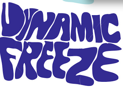
This screen shot shows how the final logo came to be from what it was at first to what it was last.
This is the first design of the logo. On the poster document, the background is black and I thought this colour would be good for it.
After thinking it over, I decided on turning the logo into a different colour, but I didn't stop there.
I then used the 'Slice' tool (I couldn't get a screen shot to demonstrate what I did so I'll explain.)
I used this tool to slice parts of the logo and do this...
With the sliced parts, I changed the colour to yellow. I wanted to make it look like there was a spotlight shining through.


No comments:
Post a Comment