What is a serif font and San serif font?
A serif font is when the main stroke of a letter ends with a detail. A San serif font is when the main stroke of a letter doesn't end with some sort of detail.
Name a San serif font and serif font?
San serif font - Times New Roman
Serif font - Arial
What is the minimum resolution to scan artwork for print and for website? Why?
For print: 300
For website: 72
If producing a vector based logo for a client, which program would you use? Why?
To produce a vector based logo, the program used would be Adobe Illustrator.
If you're improving the quality of an old, faded and damaged photograph, which program would you use? Why?
To improve the quality of an old, faded and damaged photograph, the program would be Adobe Photoshop.
If you producing an 8 page magazine for an assignment, which program would you use? Why?
To produce an 8 page magazine, the program used would be Adobe InDesign.
Wednesday, 19 December 2012
Google Logo.
Name: Shannan Malo
Google Theme: Lapfox Trax; Renard - Intensive Care Unit
Self Assessment Grade: M

Why did you choose this design?
I have chosen to do the persona (or in his case, a fursona) of Renard. I had design this from the "Intensive Care Unit" album. I wanted to do this album because out of all the albums Renard, and I mean the artist Renard, has done, this is my favourite one.
I also wanted to do him because it's not an well-known artist since his music is published and sold on his website, Lapfox Trax.
The original artwork on the album is by Squeedge, who is his girlfriend, and all I have done is re-drawn it for this Google assessment.
How have you created your designs?
I have first hand drawn the design then scanned it. I then used 'Illustrator' to colour it in. I took a screenshot of the Google search bar, re-sized it in 'Photoshop' then inserted into the design.
Is your artwork created to professional specifications?
This design was created in 'Illustrator' and the work is in vectors. The vectors make the resolution the same even if the design was printed in small or printed on a large scale.
Kate Moross Workshop.
Before

After

For this part, we were asked to create a sort of CV inspired by Kate Moross.
The work was meant to show interests, birthdate, name, etc. and it shows what and who the person is because of it.
The 'before' picture was hand-drawn then scanned onto Photoshop. I used the tool, 'Levels', to darken the line slightly.
Then I put it into Illustrator to colour.
The picture was turned into a 'Black and White Logo' in the 'Tracing' section.
I then used the 'Live Bucket Paint' to colour in the sections after making it a 'Live Paint Group'.

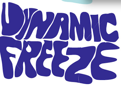
Dynamic Freeze - Final Design Development.


I then used the 'Slice' tool (I couldn't get a screen shot to demonstrate what I did so I'll explain.)
I used this tool to slice parts of the logo and do this...

Subscribe to:
Comments (Atom)