Wednesday, 12 June 2013
A-Z of Portsmouth & Evaluation.
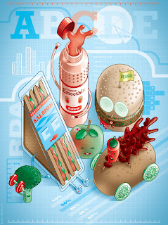
We were asked to produce a piece of work, showing an A-Z of Portsmouth.
To create this, I hand-drawed the words and the pictures then scanned into onto the computer.
I then used Photoshop is make it like this.
I used separate layers to colour in certain parts. I did the words on separate layers then the pictures.
I also separated the line art from the actual colouring to make it easier to do.
I put a boarder round to make it look less bland and I also did this because I couldn't think of what to do with the white background.
"The Urban Juice Squad" Evaluation.
These are the final 3 designs I chose to do for my Juice Squad.
I had a lot of designs, but these were my favourites of them all.
The members are 3 different animals (pig, lion and racoon) and they each have a fruit to represent them (blackberry, cherry and watermelon).
The other designs I had were animals too with their own fruit.
The reason I chose these 3 was because they looked the most visually interesting and they were the most fun to create.
Wednesday, 30 January 2013
Juice Squad - 3 of them.
Here are 3 members of the 'Juice Squad' that I have created.
I started designing characters when I was home and now I'm able to create them on Illustrator today.
They're meant to be animals/human hybrids, each with their own fruit to signify them.
The fruits are strawberry, blueberry and banana.
Juice Squad - Logos.
These are some logos for 'Juice Squad', made in Illustrator.
The third one has fruit with it; a strawberry for the dot on the 'i', a banana above the 'q' and a blueberry after the 'd'. The blueberry may not be so clear.
The colours come the 'Fruit' swatch.
I have drawn the fruit and drops using the pencil tool.
I have also used a tool called 'Stroke' to make the font look chunkier.
Wednesday, 23 January 2013
The Juice Squad - 5 Inspiring Artists.
Lee Hasler - http://www.leehasler.com/index2.html
Squeedge - http://squeedge.net/
Bryan Lee O'Malley - http://radiomaru.tumblr.com/
Arina Tanemura - http://en.wikipedia.org/wiki/Arina_Tanemura
Kepalakardus - http://shadowness.com/kepalakardus
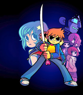 O'Malley is the creator of the Scott Pilgrim series, which is one of my favourite movies and comic book series. I like how his style has a really good cartoon feel to it. O'Malley's style inspires another style I like to do.
 Kepalakardus is an artist whose primary style is vector art. I want to do vector art style drawings myself and she shows me how good it looks. I like her style because she doesn't use shading or highlighting; it's just simple, plain colours and she makes it look really good. I like how she also has made her own characters. I've also made my own characters and I like to draw them a lot.
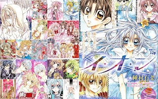 Tanemura is mangaka (manga artist) so she must hand draw her work then ink the line art. I wouldn't know how she would colour it though. I love the manga she makes, the stories are always good, but the artwork I absolutely adore. The colours are sort of pastel and Tanemura is one of the many artists I love that inspire my own work sometimes.
 I like Hasler's style because it reminds me of an retro video game style. I chose this particular art to show because I want to do fruit-like characters for my 'Juice Squad'.
Squeedge - http://squeedge.net/
Bryan Lee O'Malley - http://radiomaru.tumblr.com/
Arina Tanemura - http://en.wikipedia.org/wiki/Arina_Tanemura
Kepalakardus - http://shadowness.com/kepalakardus
 O'Malley is the creator of the Scott Pilgrim series, which is one of my favourite movies and comic book series. I like how his style has a really good cartoon feel to it. O'Malley's style inspires another style I like to do.
I really like her style because it's always so appealing to the eye. She likes to use bright colours and the line art is something jealous of; she does it so well.
 Kepalakardus is an artist whose primary style is vector art. I want to do vector art style drawings myself and she shows me how good it looks. I like her style because she doesn't use shading or highlighting; it's just simple, plain colours and she makes it look really good. I like how she also has made her own characters. I've also made my own characters and I like to draw them a lot.
 Tanemura is mangaka (manga artist) so she must hand draw her work then ink the line art. I wouldn't know how she would colour it though. I love the manga she makes, the stories are always good, but the artwork I absolutely adore. The colours are sort of pastel and Tanemura is one of the many artists I love that inspire my own work sometimes.
 I like Hasler's style because it reminds me of an retro video game style. I chose this particular art to show because I want to do fruit-like characters for my 'Juice Squad'.
Wednesday, 16 January 2013
Google Logo - Animated
This is my Google logo animated.
For this, I didn't use the tween tool.
I created multiple layers (for example, the eyes closing) and made the right layer visble for each frame.
For this, I didn't use the tween tool.
I created multiple layers (for example, the eyes closing) and made the right layer visble for each frame.
Wednesday, 9 January 2013
Animation in Photoshop - An Interesting Fact About Lobsters.
For the final task, I was asked to make an animation featuring an interesting fact. I couldn't really find good facts on the Internet, but I remember hearing how lobsters aren't naturally red.
Animation in Photoshop - Blur.
For this animation, I was asked to make the letters blur. To do this, there needed to have four frames. One with the letters at top, then at the bottom, then blurred and then back at the top.
There was also two layers, the letters normally and then one blurred.
To hide one of the layers so it doesn't overlap and look bad, the right layer had to be hidden.
The extra frames were added later.
There was also two layers, the letters normally and then one blurred.
To hide one of the layers so it doesn't overlap and look bad, the right layer had to be hidden.
The extra frames were added later.
Animation in Photoshop - Name.
In today's session, I was taught how to create animations in Photoshop. I made two animations for testing and then I was asked to make one with an interesting fact with it.
To do the animation in Photoshop, a new document must be made and at the bottom of PS, there is something called 'Timeline'. I then clicked 'Create Frame Animation' to do this.
For the first animation, our task was to move our name from top to bottom. To do this, we needed a layer that had our name at the top then one at the bottom. The layers would also be in two different frames (One at top, one at bottom).
I then highlighted the frames and clicked on 'Tweens animation frames" and added some extra frames to create what I have made.
Subscribe to:
Comments (Atom)


.gif)


